







Imagine this: you’ve placed a bulk order of 500 custom enamel pins for your brand launch. The shipment arrives — and the text is blurry, the colors look nothing like your mockup, and the fine lines have vanished into the metal. Now you’re stuck with 500 unusable pins and a missed deadline.
For traders, retail buyers, and brand managers, design mistakes aren’t just a creative inconvenience — they’re a real business cost. The good news? Every single one of these mistakes is 100% avoidable once you know what to look for. This guide walks you through 12 of the most common enamel pin design mistakes, so you can submit production-ready files and receive pins that truly represent your brand — the first time around.
First, Understand the Medium: Screen vs. Metal
Before diving into specific mistakes, there’s one thing every buyer needs to understand: what looks great on a screen may not work at all in metal and enamel.
Digital files are made of pixels. Enamel pins are made of die-struck metal filled with colored enamel — and that physical reality comes with hard constraints. Minimum line widths, color separation rules, plating choices, and manufacturing tolerances all affect the final result in ways a digital preview simply can’t show.
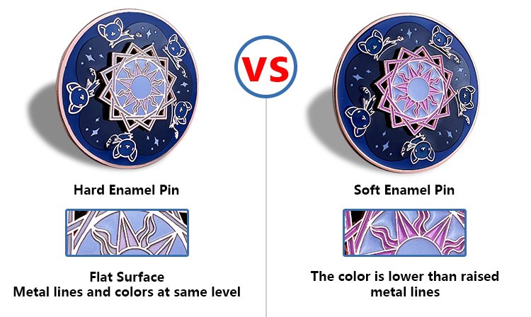
This distinction matters even more if you’re ordering soft vs. hard enamel pins. Soft enamel pins have raised metal edges and recessed color fills, giving them a textured, hand-finished look. Hard enamel pins are polished flush and feel glassy-smooth — but they demand even cleaner, flatter artwork to look their best. Knowing which type you’re ordering should shape how you approach designing a pin from the very first sketch, not as an afterthought once the file is “done.”
The 12 Mistakes (And How to Fix Them)
Group A: Artwork and Visual Problems
These are the mistakes that live inside the file itself — the ones a designer can fix in five minutes once they know the rule.
Mistake 1 — Lines and details that are too thin
Fine lines look elegant in Illustrator. In metal, those same lines may simply not reproduce — or worse, they break unevenly across the batch. Any line thinner than 0.3mm is a production risk. Thicken all outlines and internal dividers, and merge delicate details into bolder shapes.
Mistake 2 — Overloading a small canvas
Most enamel pins measure between 1 and 2 inches. At that size, a design packed with intricate imagery becomes visual noise. If you have to squint to make out the details on your screen, your customers won’t see them at all on the pin. Simplify to the core idea — a strong silhouette will always outperform a cluttered composition.
Mistake 3 — Unreadable text
Text is one of the trickiest elements when designing a pin. Thin serif fonts, long sentences, and small font sizes all become illegible once transferred into metal. Stick to short phrases or initials, use bold and simple typefaces, and keep text large enough to read without magnification. If in doubt, convert your text into a graphic element rather than live lettering.
Mistake 4 — Using gradients, shadows, or photographic shading
Traditional enamel is filled in flat, solid color — there’s no way to replicate a gradient or a soft drop shadow in standard enamel production. Designs that rely on these effects for visual depth will look flat or muddy once manufactured. Replace gradients with distinct color blocks, and let the raised metal lines themselves suggest dimension.
Mistake 5 — No defined border or unsafe bleed edges
A design without a strong outer border can look ragged and uneven once the metal is cut. Colors that run too close to the edge may bleed or misalign. Always include a clean metal outline around your design, and leave a safe margin between your artwork and the edge of the pin.
Group B: Color and Finish Problems
Color and plating decisions look small on a spec sheet, but they’re often what separates a pin that “pops” from one that disappears the moment it’s pinned to a jacket.
Mistake 6 — Too many colors or poorly separated color areas
Every distinct color in an enamel pin requires its own fill — more complexity, higher cost, more room for error. For most pin designs, four colors or fewer is the sweet spot. Just as important: each color area needs a clear metal border separating it from its neighbor. Skip that separation, and colors will bleed into one another during production.
Mistake 7 — Ignoring metal plating as part of the design
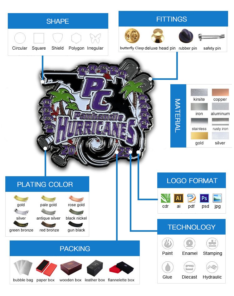
Gold, silver, antique brass, black nickel — the plating color isn’t just a frame around your design. It’s an active part of your color palette. A design that pops beautifully against gold plating may look flat and lost against silver. Choose your plating early in the design process, not as an afterthought, and preview your artwork against different plating options before signing off.
Mistake 8 — Low contrast that kills visibility
Enamel pins are small objects, often viewed from a distance or pinned onto a jacket at arm’s length. A design with subtle, low-contrast color combinations may look sophisticated in a mockup but disappear completely in real life. Prioritize contrast — dark against light, bold against neutral — so your design reads instantly.
Mistake 9 — Adding special effects as an afterthought
Glitter enamel, translucent fills, epoxy coating, glow-in-the-dark enamel — these are exciting options, but they need to be planned from the beginning, not bolted on at the end. A design that works as a simple flat pin will benefit from a well-chosen effect. A design that depends on effects to carry it will usually disappoint. Decide on your finish options early, and design with them in mind.
Group C: Strategic and Production Problems

These last three mistakes rarely show up in the artwork file — they show up months later, when the pins don’t perform the way you expected.
Mistake 10 — Not designing with purpose
A brand awareness pin, a retail collectible, an event commemorative, and a promotional giveaway all have different design requirements. Brand pins should reinforce logo recognition and color consistency. Retail collectibles need strong visual appeal at point of sale. Event pins often need a date and name to carry meaning. Before briefing your designer, ask: what is this pin supposed to do? Then design backward from that answer.
Purpose also extends beyond the artwork itself. Corporate buyers and brand managers should think about where to place a lapel pin before finalizing the design — a suit jacket lapel, a tote bag, a lanyard, or a product package all call for different sizes, shapes, and attachment hardware. That context should inform the design from day one, not get bolted on after the fact.
Mistake 11 — Submitting the wrong file format
This is one of the most avoidable mistakes in the entire process — and one of the most common. Sending a low-resolution JPEG or a flat PNG to your manufacturer almost guarantees problems: jagged edges, color shifts, and misread details. Always supply vector files (AI, SVG, or PDF) where possible. Make sure colors are separated into distinct layers, and include written notes specifying size, plating, and any special requirements. Clear files lead to clean pins.
Mistake 12 — Choosing a supplier that doesn’t offer proofing or consultation
Even a perfect design can go wrong if your manufacturer doesn’t communicate. Before committing to a bulk order, confirm that your supplier offers digital proofs, physical samples for large runs, and free revision rounds. A good supplier will flag potential production issues before they become expensive problems. The cheapest quote is rarely the best value if it comes without support.
Pre-Production Checklist for Bulk Buyers
Before you submit your order, run through this checklist. Share it with your designer before every project.
- All lines are at least 0.3mm thick
- Design is legible when viewed at actual pin size (print it out and check)
- Color count is four or fewer, with clear separation between areas
- No gradients, soft shadows, or photographic effects
- Text is bold, minimal, and large enough to read clearly
- Metal plating color has been chosen and factored into the design
- A strong outer border is included
- Special effects (glitter, epoxy, glow) are planned, not improvised
- File is submitted as a vector (AI, SVG, or PDF) with labeled layers
- Design purpose has been defined: brand, retail, event, or promotional
Great Pins Start Before the Order
Custom enamel pins are one of the most tactile, collectible, and brand-building products a company can invest in. But at scale, the margin for error is small — and the cost of getting it wrong is real.
The good news is that most of these mistakes are entirely preventable. With the right design brief, production-ready files, and a reliable manufacturing partner, your pins will arrive exactly as you imagined them: sharp, vibrant, and ready to represent your brand.
At 독창적인 맞춤 핀, we review every artwork file before production begins, flag potential issues early, and work with you through every revision until your design is perfect. Whether you’re ordering 100 pins or 10,000, we’re here to make the process smooth — and the result exceptional.
자주 묻는 질문
How many colors can an enamel pin have?
Most manufacturers recommend four or fewer colors for clean, cost-effective production. More colors are possible but increase complexity and price.
What file format should I send for custom enamel pins?
Always use vector formats — Adobe Illustrator (.ai), SVG, or PDF. Avoid JPEG or PNG unless your manufacturer specifically requests them.
What is the minimum line width for an enamel pin design?
A general safe minimum is 0.3mm. Anything thinner risks not reproducing correctly in metal.
What’s the difference between soft and hard enamel design rules?
Hard enamel requires flatter, simpler artwork with especially clean line separation because the surface is polished flush. Soft enamel is more forgiving of textured designs but still requires clear color boundaries.
How do I avoid wasting money on a bad bulk pin order?
Request a digital proof before production begins, ask for a physical sample on large orders, and work with a supplier that offers revision support and production consultation.